
Are you looking to delve deeper into your analytics data, find inspiration on how to make your reports more engaging or do you just want to recreate your favourite Universal Analytics reports? Either way GA4’s Exploration section offers a world of possibilities for creating custom reports so you can interrogate your data in new and more creative ways.
At first this can seem intimidating. After all GA4 does not provide a lot of guidance on how to use these tools from within the Google Analytics dashboard. However, once you have learned how to use the most common report templates, you will realise that you can create all sorts of graphs, charts and visualisations to represent any data that GA4 has recorded.
First of all, you may not actually need to create a new report from scratch. GA4 makes it really easy to customise your existing reports to modify the data on display. Follow the steps below for instructions on how to do this.
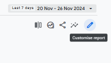
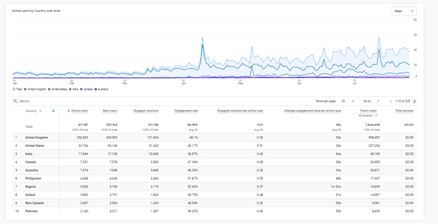
You may want to clean up your reports and remove data that is not relevant to you. The example above shows a blog website that doesn’t sell anything, so the revenue metric is not relevant.
You can add new metrics into your reports in the same way. For a table report this will add an additional column to the table. If you desperately miss the ‘Bounce rate’ metric from Universal Analytics you can add that in to your reports.
Once you are happy with your report you can choose to save it as a new report of keep the modified version of the default report.
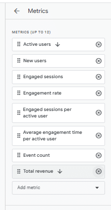
Dimensions are qualitative attributes of data. They are descriptive ways of categorising data. In the table above ‘Country’ would be the dimension
Metrics are measurements that have a numerical/quantitative value associated with them. Number of page views, engagement rate, total revenue would all be examples of metrics.
If the existing reports are not giving you what you need, GA4 Explorations is the place to go. This allows you to start with one of 6 templates or techniques for analysing your data:
Free-Form Exploration: This is a highly flexible tool for analysing data in a drag-and-drop format. Users can create custom tables, charts and maps by combining dimensions, metrics, and segments.
Cohort Exploration: This technique focuses on analysing groups of users (cohorts) who share a common characteristic or event, such as users who made their first purchase in the same week. It’s often used to study retention, engagement trends, or the impact of marketing campaigns over time, helping to identify factors influencing user loyalty or churn.
Funnel Exploration: This tool visualises a series of steps (events) users take toward completing a goal, such as making a purchase or signing up. It’s useful for identifying drop-off points, optimising conversion rates, and understanding the effectiveness of specific touchpoints in guiding users through the website.
Segment Overlap: This allows users to compare how different segments of users overlap. For instance, you can see how many users are both high spenders and frequent visitors. This might help you identify connections between different user characteristics and behaviours that you might not have otherwise identified.
Path Exploration: This technique maps the user journey by showing the sequence of events leading to or following a specific action. It is open-ended and user-driven, rather than following a linear set of pre-defined steps, which differentiates it from the funnel exploration. It is ideal for analysing user navigation patterns, uncovering unexpected behaviours, or optimising flows like checkout processes or content consumption.
User Lifetime: This exploration focuses on the value and behaviour of users over their entire lifetime with the product or service. It’s used for tracking metrics like lifetime revenue, average engagement, and overall user value, providing insights into long-term trends and customer loyalty.
Setting up these reports uses a similar user interface to customising existing reports, you can select the type of data visualisation to use, as well as which dimensions, metrics and segments to use. Why not have a play around to see what reports you can come up with, or try and recreate our 5 favourites.
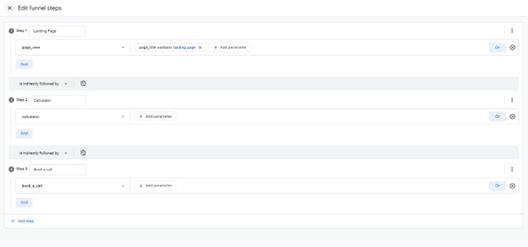
Using the Funnel exploration we can track a customer through the steps of a marketing campaign, providing each step corresponds to an event that is being tracked by Google Analytics.
An example of this could be a campaign where the customer starts on a specific landing page, uses a calculator which shows how much they could save by using a service and then fills out a form to book a call with the sales team.
You can use this report to see how many people are converting from your marketing campaign, which steps are working well and which are leading to a high percentage of site exits.
To create this Funnel go to the Explore section of GA4 and Click on the Funnel Exploration option.

You will land on this screen below. This may look intimidating but once you have got the hang of it all custom reports are going to be created using a similar interface.
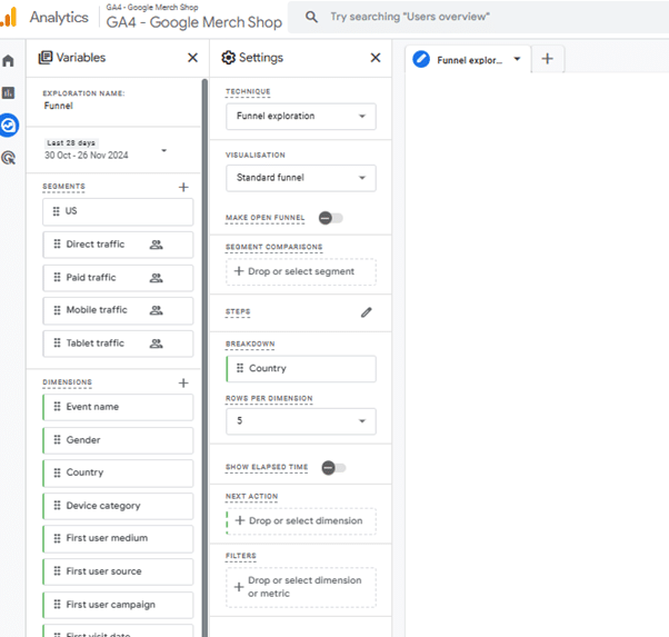
First of all choose between a standard funnel or a trended funnel. A standard funnel displays how many people completed each step of the funnel in a bar graph, whereas a trended funnel shows a line graph showing the number of users who completed steps of the funnel each day of the selected time period. For this example let’s stick with a standard funnel.
Make open funnel: Choose whether to only track when users follow steps in the correct order or also record when a step is skipped. Maybe some people will visit the landing page and book a call without using the calculator in our example so we will make it an open funnel.
Click on the pencil icon next to steps and select the events that correspond to each step.
In our example the first step is a page view, but we only want to track views of the landing page so we will add a parameter “page_title contains Landing Page” to ensure we only track visitors to the landing page for this campaign.
The second and third steps are triggered when someone uses the calculator and fills out a form. We have set up custom events for these steps. If the steps you want to report on don’t correspond to events that are tracked by GA4 by default, such as a page view or purchase, you may also need to create custom events.
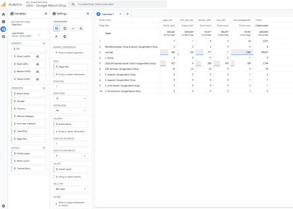
One of our favourite reports to create is categorising key events to see what segments of traffic are converting well. An example of this would be to create a free-form table showing which pages lead to the most key events.
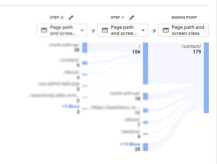
If most key events on your site take place on a contact page you may want to find out which pages people are visiting before they visit the contact page and are contributing to conversions. This is a great use for the path exploration report.
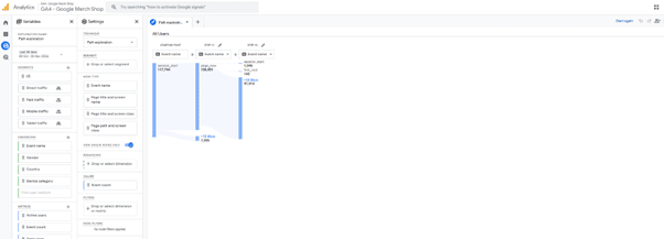
2. Now you will get the option to either set a starting point or ending point for your exploration.
3. For this example we want to choose an ending point, so we click on the option to ‘Drop or select node’ under Ending Point.
4. You could either select the event name that people will be doing on your contact page or the page itself. In this case we will select Page title and screen class and then choose Contact page from the options provided.
5. From here you will be able to view the previous pages that were visited before the contact page, you can expand the exploration to look at which pages were visited earlier in the journey as well.
Hopefully this will give you some ideas for how you can use Custom reports in GA4 to learn more about your customers and find ways to improve their experience on your website. If you would like further training on Google Analytics or help turning your insights into actions why not why not get in touch withdigital to discuss our web analytics service.


